By Mike Hebrard
After 20 plus years of painting logos for sporting games and special events, I have reinvented my techniques and myself several times. At first I went by the “Guess and By Golly” method where I would look at a drawing and paint marks, connect them and create a letter or logo. Most of them were deemed too small and detailed for recognizable visual impact. Then I started projecting the image with an opaque projector on a paper woven mesh (Saxolin X, recyclable paper netting used to cover chip filled railroad cars), which is distributed to landscapers for erosion projects. I noticed that they would measure and paint dots to create a planting pattern using different colors indicating which plant went where. Being made of a woven brown wax coated paper, it retained the paint. But then I had to relay it on the grass by simply repainting on the paper pattern, which was hard to do with straight lines.
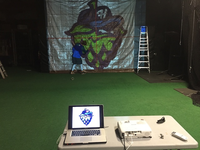
There are some simple techniques I have used over the years depending on what works best at the time or what I have available. In the old days, school opaque projectors were used to manipulate the desired image onto a wall that required moving the projector back and forth to fit the size needed. Sometimes your images might not be sharp. Nowadays with the new computer technologies you can hook up your laptop to an LCD projector and have options to zoom or keystone the image without having to move anything.
You might think a 10-foot image is big, but once it is laid out onto a field it is dwarfed by the large amount of grass you want to paint. Also for you to project an image large enough you need to have a taller wall such as in a gym or warehouse, requiring ladders and the ability to darken the room to be able to see the projected image. Once the image size has been projected, you can hang a sheet of visqueen, or what I prefer, a poly tarp with grommets. By carefully cutting half-moons on the straight and curved lines you will create a usable pattern to spray dots in the exposed cutouts.
Poly tarps come in a variety of sizes, colors and thicknesses. I like white which because it is easier to mark. If the logo is only used a couple of times, I go with a thinner mil, but it is bigger. For a progressive program, I go with a much thicker mil. An outdoor store has a variety of bags that I buy to store the stencil. I use luggage tags that contain the laminated logo to attach to the bag. I also include a colored laminated image in the bag to aid in painting. Once the stencil has been carefully cut, the first application will leave the color that corresponds with the cutout. Be careful when using inverted aerosol cans to mark the cutouts on clear visqueen, as the propellant will cause the edges to curl, losing your acuteness.
Another method I have used is having a sign shop print out the logo on inexpensive paper (usually in 5-foot widths) and then taping the sheets together completing the pattern. After marking the centerlines on the tarp, center the paper pattern onto the tarp and tape it to the tarp. Using a sharp box cutter cutting through both the paper and tarp, you will need to rotate and replace your blade a couple of times to get a clean cut.
If you have a logo or image already established on turf or floor, take the clear sheet of visqueen and tape and trace it with a sharpie, and repeat the aforementioned process of cutting out the half-moons. It helps to duct tape the corners to allow for a screwdriver to punch through to hold it down. Also, don’t leave the sheet down too long or the clear plastic can burn the grass blades.
When short on time, it may be necessary to freehand the logo on a predetermined location. I have developed a PowerPoint slide that has a grid for both landscape and portrait. There is a grid option for the slide but you can’t print it. So I draw a vertical line and copy and paste it for each line and repeat the process horizontally. Then group all the lines (they will then be frozen in that slide), import the image and enlarge it so that the top or side aligns with one of the grid lines. Then use the option “send image to back.”
Now when the page is printed the lines will appear over the image with the grid lines being 1 inch apart. I then use an engineer’s ruler and decide what scale to use. You can make the grid into 2 foot or 8 foot squares, whatever fits your requirement. I also like to make the centerlines red for quick reference to measure from. It helps to laminate the page or put it into a clear plastic sheet protector and bring a portable table to measure off of. Usually I string out the centerlines and set one for the top and bottom of the image.
Since you will be basically free handing the image onto the grass, you might as well freehand it on a tarp if the logo might be used again. If you have a simple block letter, I usually mark the corners of the letter and box it in with string. This will allow you to make any changes before painting the incorrect line. I also use spray chalk to allow for change in measurements and removal with a simple wet rag or water hose. Spray chalk is available in some basic colors: white, yellow, red and blue.
For end zones I try to get the text printed in the actual font in a larger scale. Mark the center of the end zones and string top and bottom of the text. I try not to go larger than 20 feet. Once the start of the first letter is established, set a tape measure at the starting point at the top and bottom. With the engineer ruler measure and mark the start and stops of each letter and other edges. We use a 1½-foot square tubing to the height of the letter and then use our “Disc” to paint an outline on all of the edges. Then fill in the letter.
I use two different methods when laying out and painting text. The first method is what I refer to as a text box. Usually the letters are maxed at 3 feet high. I get a piece of flat cardboard, cut out the desired height and width, and by using an inverted aerosol can I can freehand a letter with a basic font staying inside the cutout, using the edge of the cardboard as my straight edges. For bigger text, 6 feet or so, I make a frame out of ¾-inch PVC with elbow and create a square or rectangle. We use the “Disc” with a tip size on the airless that has the desired width of spray and basically do the same process.
The second method was created by luck. I went to pick up new football numbers from my sign company that routed them on HDPE 1/8-inch thick. They mentioned to me that they made a whole alphabet set for a track painter and had all of the positives they cut out! “Do you want them?” they asked. Yes! With a little duct taping we now have the entire 3-foot high alphabet that allows us to quickly spell out a slogan. We usually trace the letter with a contrasting color and then fill it in with another color. This gives us a professional looking font. I use my football numbers when doing dates for a logo with numbers 0 – 5, and had the sign company make a 6, 7 and 8 (the upside down 6 can be used for a 9). Also many number kits come with a G that can be used for “GO” with the 0.
Mike Hebrard is president of Athletic Field Design, Clackamas, OR, www.athleticfield.com.